

Client
Pomelo
Year
2021
Type of Work
BrandingStrategyNamingVisual DesignDigital DesignPackaging Design
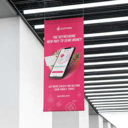
The refreshing new way to send money.
It’s free. It’s instant. It’s international. And it’s actually 100% free every time you send money to your family members abroad.
Context
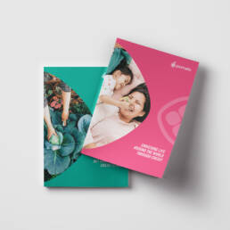
Pomelo is not just changing how money moves, they are changing the dynamic in a family relationship. Repeated requests for money and a constant need to send remittances are a burden. Pomelo’s vision is to change that. Families who use Pomelo enjoy a new dynamic that is now marked by trust, accountability and gratitude. Instead of constantly playing catch-up and hoping money arrives on time, Pomelo makes funds available before any urgent need.
Solution
Working with the founders even before seed funding, we helped develop the idea of the remittance credit offering and built the brand and product offering around that vision. From developing the name, creating a robust brand identity, supporting app development, designing the card itself, through to launching the site, Pineapple collaborated with the entire company to help bring the modern remittance offering to life.
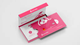
01 Band Identity
We developed the brand around the idea of the pomelo, a citrus fruit near and dear to the hearts of Pomelo’s target audience in the Philippines. The brand mark was based on the shape of a squircle brought to life in the bright pinks and greens. These colors spoke to a cultural affinity for bright tropical colors that made the brand friendly and alive and broke away from the traditional financial color palette.

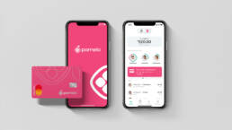


02 Digital Brand Execution
We applied a storytelling approach to the Pomelo website, showing their unique financial pathways that allowed for US based professionals to not only send money in an easily manageable way but allow for them to build credit at the same time.

Related Work

Chika
A gourmet Mexican rosticeria. Delivered with a kick.

Suspiro
Discover the Fusion of Spain and Peru at Suspiro.
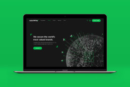
Appdetex
Securing the world’s most valued brands.

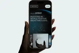
World Positive Report Vol 1
Welcome to a World Positive future.

XY Retail
The future of retail is omnichannel.

Foresite Labs
Launching companies that will transform healthcare.

Formant
We speak robot.
Policygenius
Securing the global community with open-source transparency.
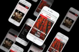
Curran
A cultural hub for all of San Francisco.
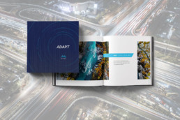
MemSQL
Adapt in real time.
Obvious Brand Evolution
Securing the global community with open-source transparency.

Zazil Cocina Mexicana
Cocina Mexicana